Hi everyone, long time no see.
This article was actually finished about two months ago, but I lost the original draft because of poor backup. Recently, I finally had some free time, so I went back through all the photos and videos and rewrote the whole thing.
This time, I also shot a large number of photos and videos for reference. To be honest, the color of the 5712A blue dial changes a lot under different lighting. Almost every photo can show a slightly different tone. I took a few hundred shots just of the color changes alone, and in this post I will only share the more obvious examples.
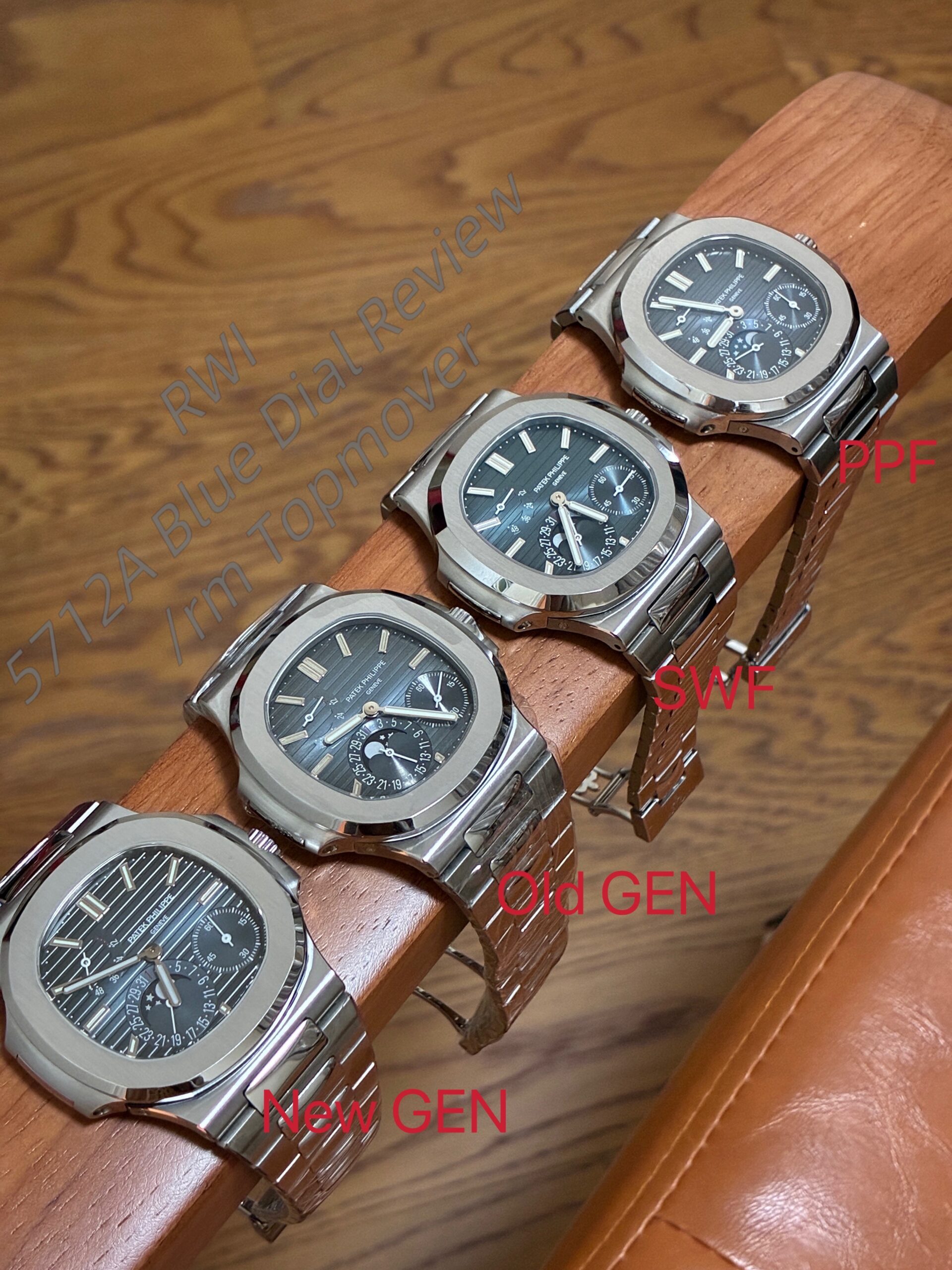
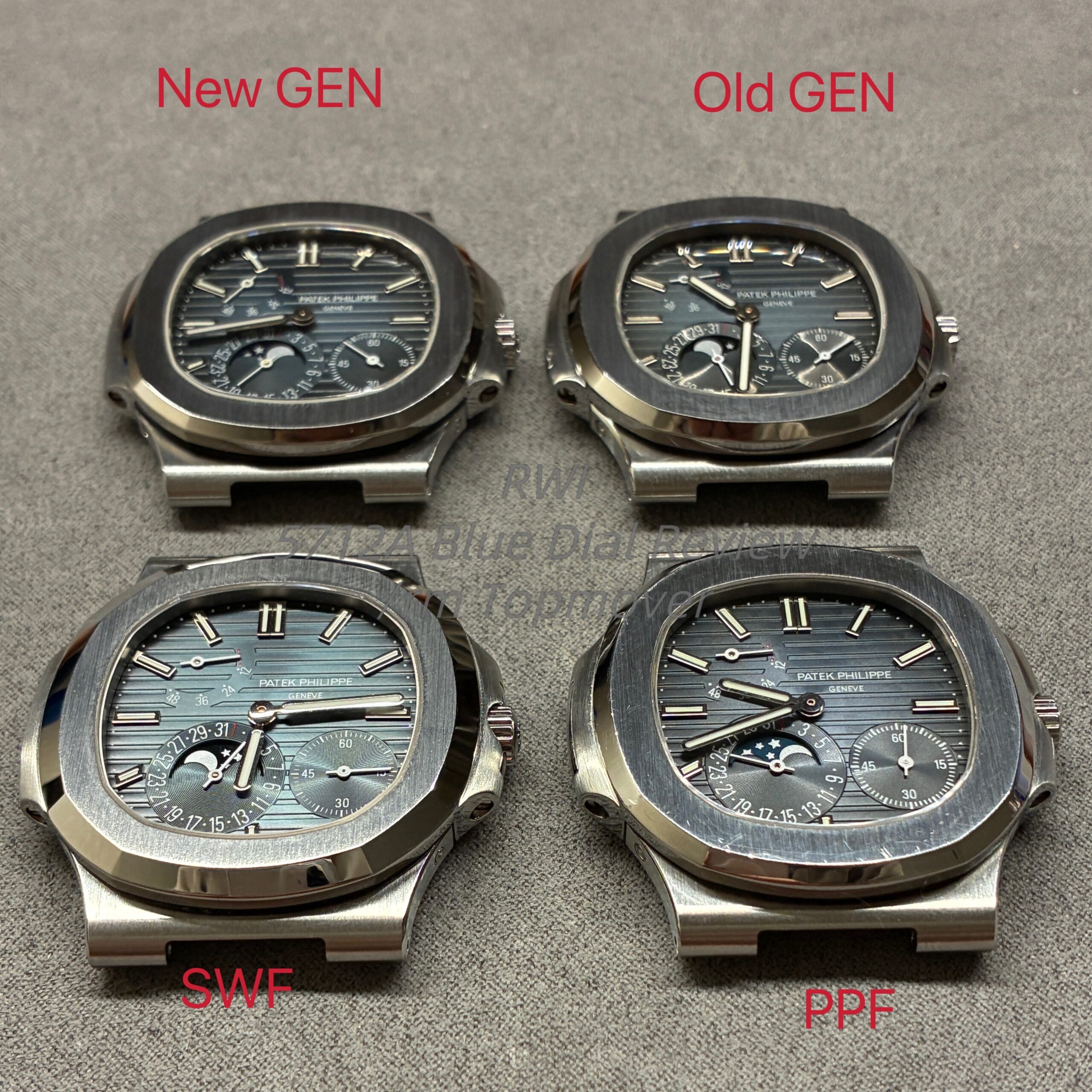
This time, I will be comparing the following 5712A blue dials:
- Newer GEN dial
- Older GEN dial
- Latest SWF dial
- Latest PPF dial
Before getting into the details, there is one important point to clarify.
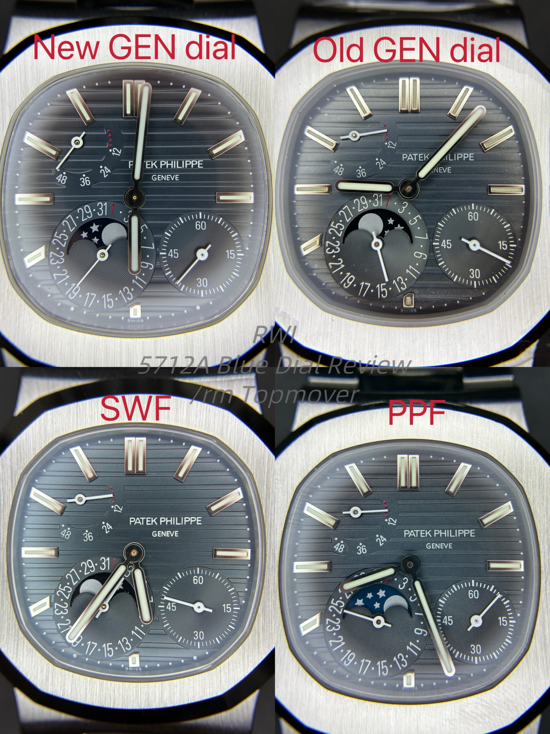
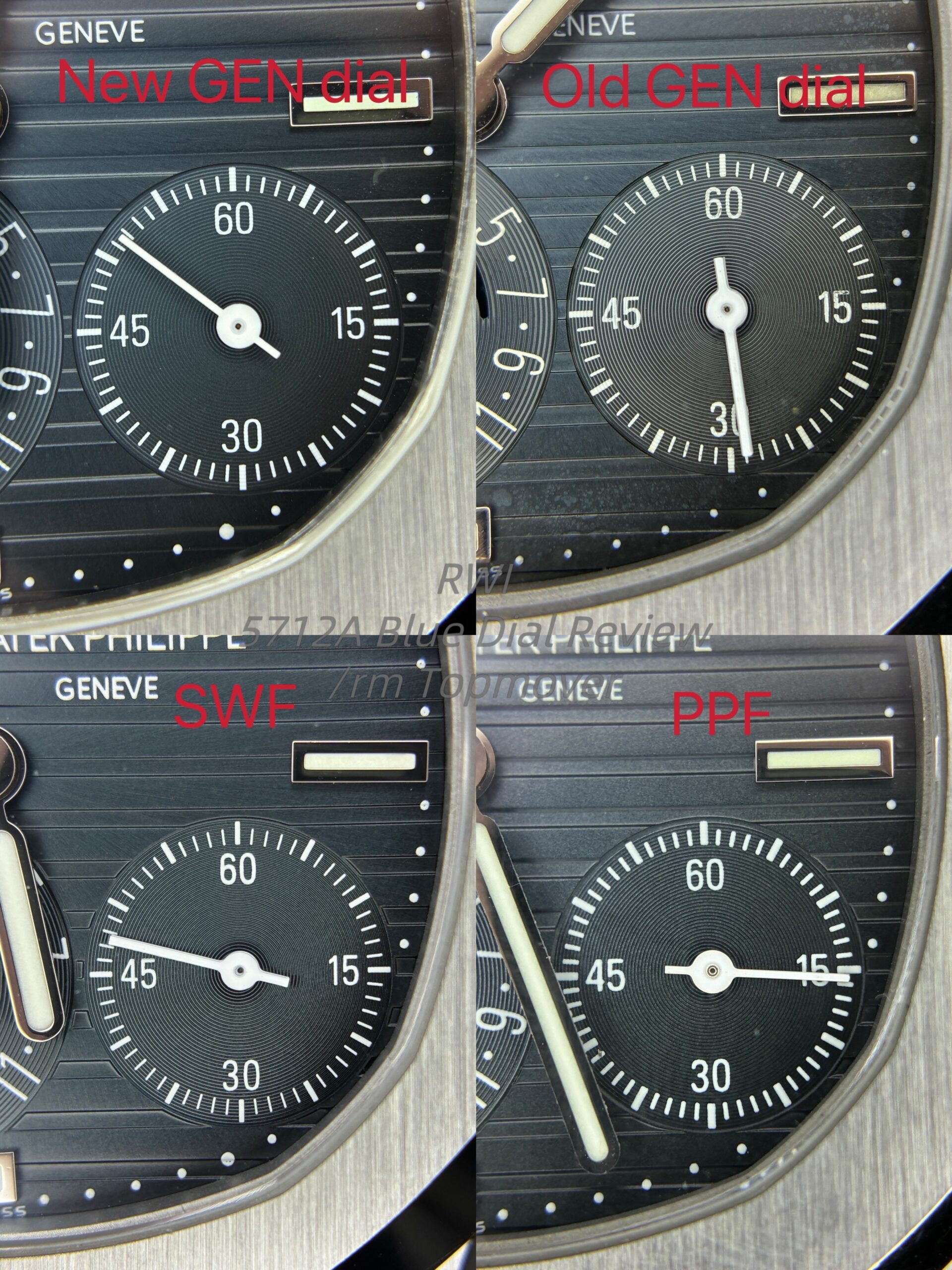
There are actually two noticeably different color versions of the GEN 5712A blue dial.
Yes, the GEN 5712A dial does not come in only one exact shade. The older version has a more blue-green tone, while the newer version is more blue-black. The difference is not small, and it is quite visible in person.
That said, this does not affect the main direction of this review too much, because both SWF and PPF appear to have based their dial molds on the newer GEN dial rather than the older one. So when discussing the printing style, execution, and overall direction, the newer GEN should be the main reference.
I am trying to write this from the perspective of a regular buyer, especially for people who are planning to buy or build a 5712A. If you are already familiar with this model, some of these points may not be new. But if you are seriously looking into a 5712A blue dial for the first time, I suggest going through the photos, videos, and comments carefully.
There are three main things I think people should pay attention to in this review:
- Local details
- Execution and printing quality
- Color performance and overall refinement
1. Magnified Details
1.1 “PATEK PHILIPPE” Text
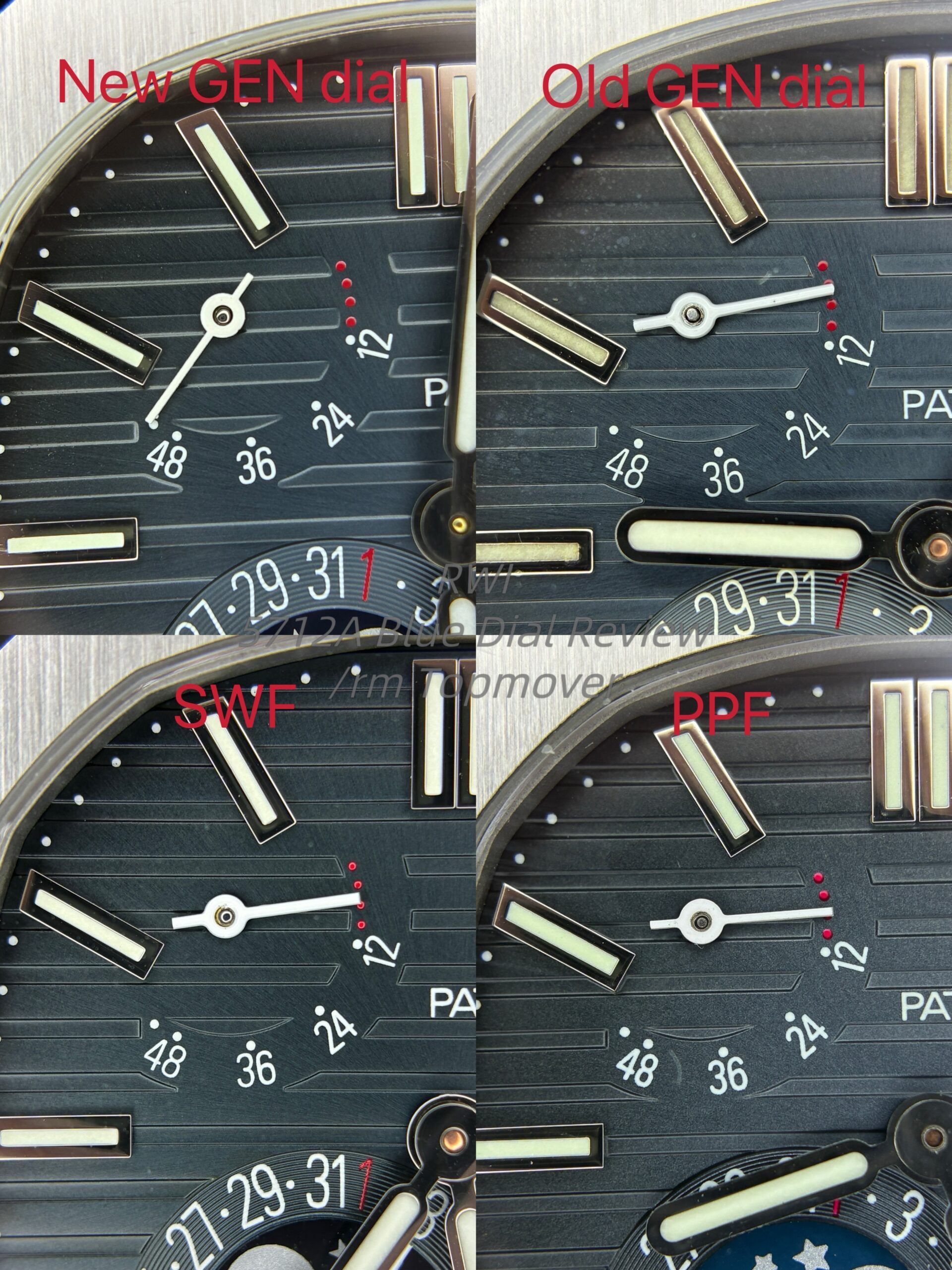
Under magnification, the “PATEK PHILIPPE” text is not exactly the same between the two GEN dials. The newer GEN dial has slightly thicker lettering, and the printing also looks a little brighter than the older one.
Since both SWF and PPF clearly follow the newer GEN direction, that should be the more relevant reference point here.
Personally, I think SWF performs slightly better than PPF in this area. It looks cleaner overall, and the execution feels a bit more convincing.
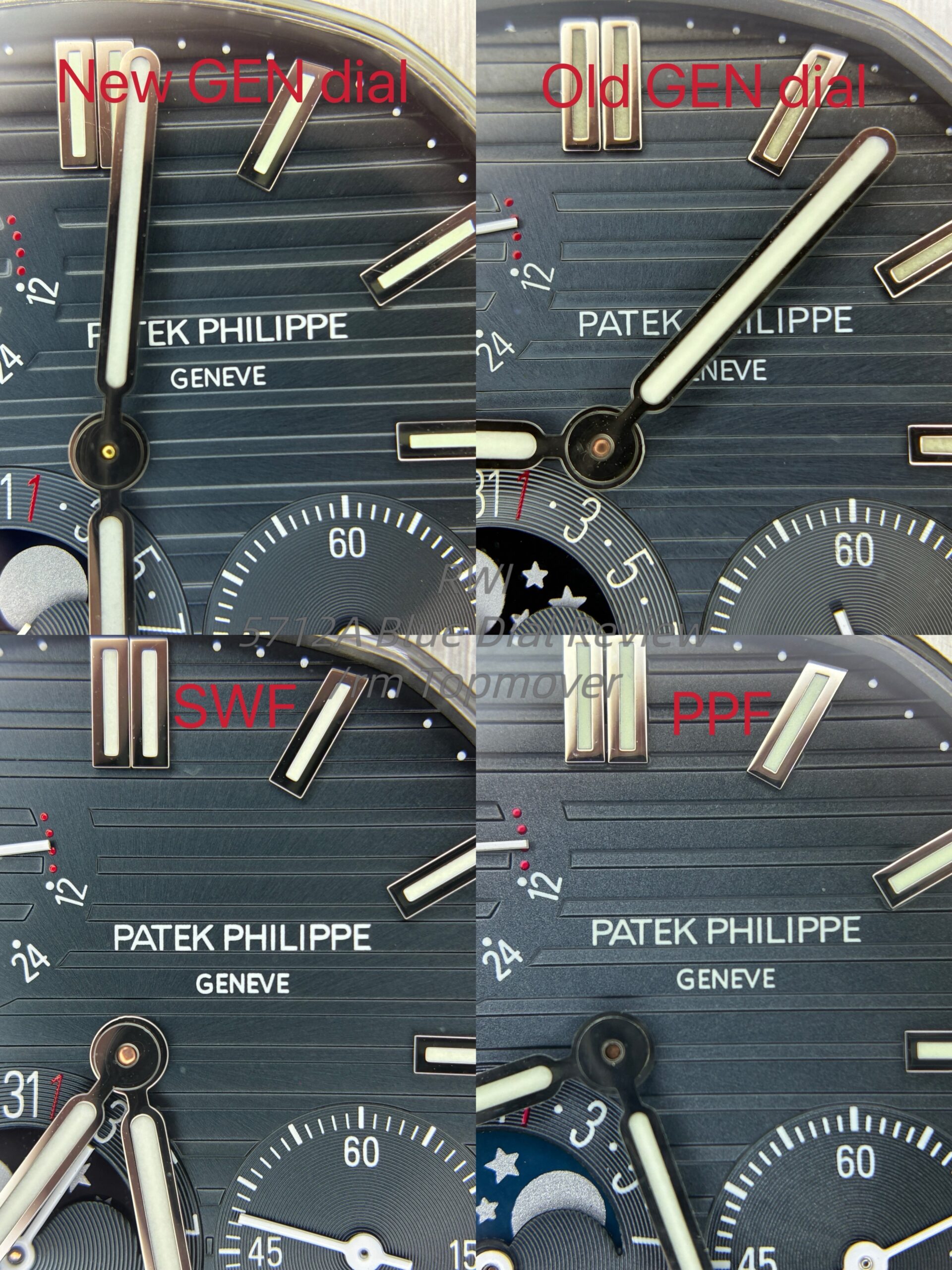
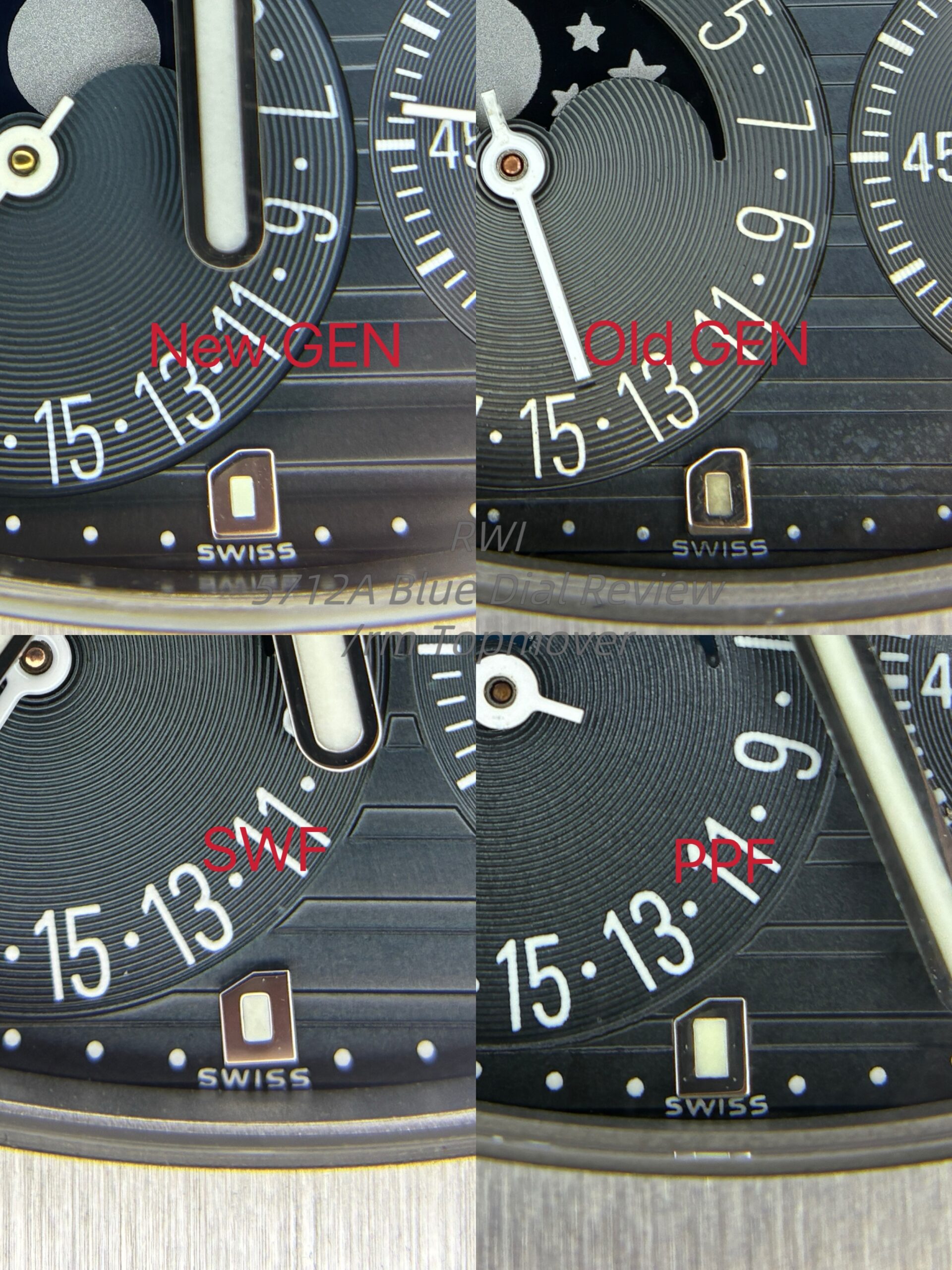
1.2 Other Numerals and Ink Application
This is another area I care about a lot.
SWF’s ink application is, as usual, cleaner and crisper. The edges look sharper, the printing looks better controlled, and there is basically no obvious bleed. PPF is not terrible, but when placed next to SWF, it still looks a bit less refined. This difference is easier to notice under magnification, and those small differences eventually add up to a different overall impression.
If you care about whether a dial feels properly finished, this part matters.
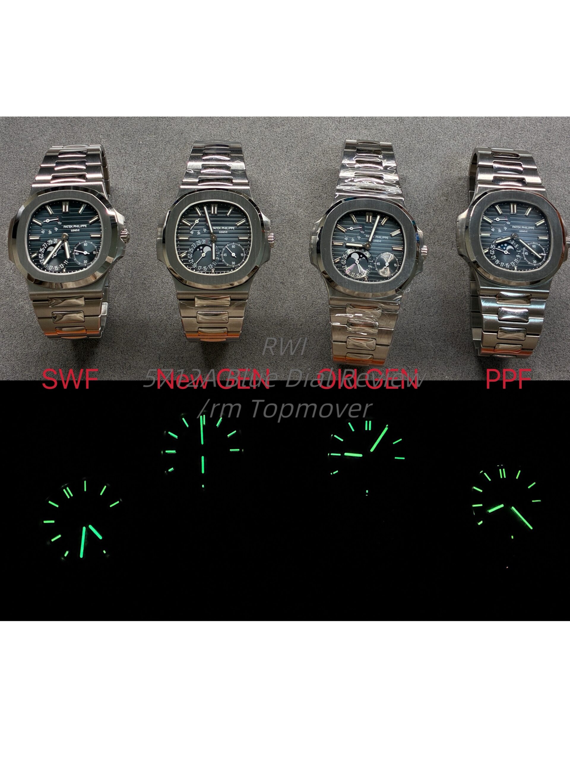
1.3 Lume
PPF’s lume has never been one of its strengths, which is also one of the reasons why I do not really recommend it.
It tends to take on a greenish hue, and this issue becomes especially noticeable once the lume is fully charged under strong light.
1.4 Hour Markers
Overall, I am still satisfied with the markers. At least among the dials in this comparison, I do not see any major issue here. The markers are fairly precise and readable, so I do not think this is where the biggest gap appears.
2. About Color: The Most Important Part of the Dial
Color is obviously the most important and most immediately noticeable part of the 5712A dial. At the same time, it is also the hardest thing to judge from a single photo.
A 5712A dial cannot be judged purely by how it looks under one lighting condition.
Some dials may look acceptable indoors, but once you take them into sunlight or under spot lighting, the flaws become obvious. Other dials may look average at first, but under the right lighting they show better depth and a more natural transition.
That is why I tried to judge these dials under different lighting conditions instead of relying on one static set of pictures.
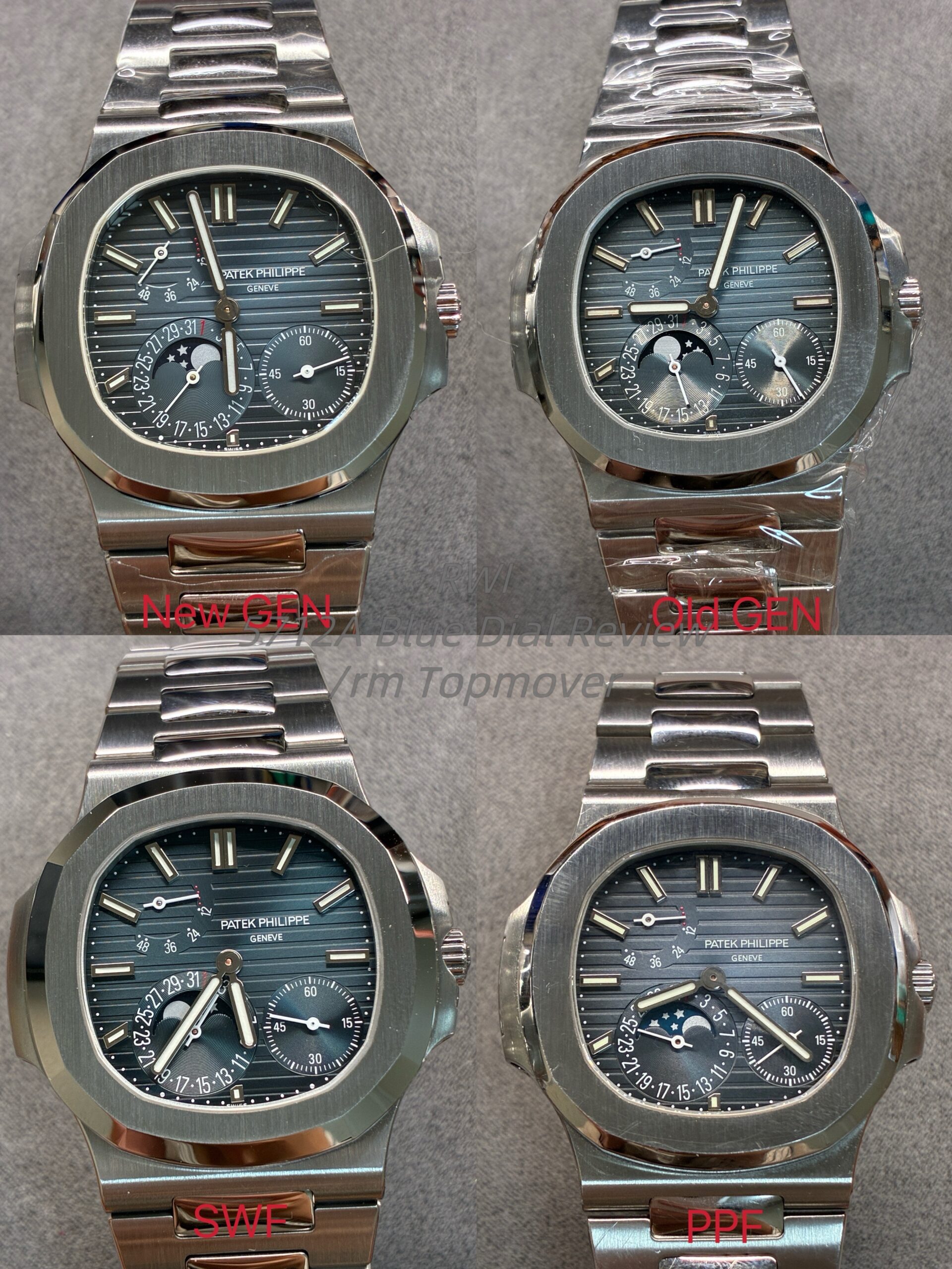
3. Under Bench White Light / Warm Indoor Light
Under bench white light and warm indoor light, I still lean toward SWF.
The reason is not simply that its color is closer to something. What gives SWF the edge, in my opinion, is that it looks more balanced, more controlled, and more refined as a whole. This advantage is not created by just one specific detail. It comes from the combined effect of the text, ink quality, base tone, depth, and the way the dial is executed overall.
Compared to SWF, PPF does not completely fall apart in this lighting, but the overall presentation still feels a little weaker. It does not have the same mature and coherent look.
4. Under Outdoor Sunlight
Under sunlight, the difference becomes much more obvious.
My impression is very direct: SWF looks more refined and more premium under sunlight, while PPF starts to show a noticeably cheaper-looking quality. This becomes especially obvious under strong sunlight or spot lighting.
What I mean by “cheap-looking” is not just that the color is off. It is more about the entire presentation of the dial under strong light: the way it reflects light, the sense of depth, the transition of the base tone, and the overall finish. Taken together, it simply does not look as natural as SWF.
That is exactly why I believe a 5712A dial should never be judged from static photos alone, especially not from one lighting setup only.
5. Why I Keep Stressing “Overall Refinement”
I remember there was once a forum post comparing the APS 15500 grey dial to GEN. One set of comparison photos in particular was very typical: the two dials did not look dramatically different at first glance, but under certain lighting, the difference in base tone became much more obvious.
The 5712A follows the same logic.
Under the same lighting, the same angle, and the same conditions, SWF and PPF can show two quite different color expressions. And sometimes that difference is not subtle at all. Even so, color should still not be the only standard.
Color should not be the only factor when judging whether a dial is actually good or not.
You also need to look at everything else together:
- Whether the text is properly executed
- Whether the ink application is clean
- Whether the lume looks natural
- Whether the markers are precise
- Whether the dial has depth
- Whether it looks refined or cheap under changing light
Only after considering all of these factors together can you judge which dial is the better choice for the money.
6. My Conclusion
If I had to reduce everything to one sentence, my conclusion is still this:
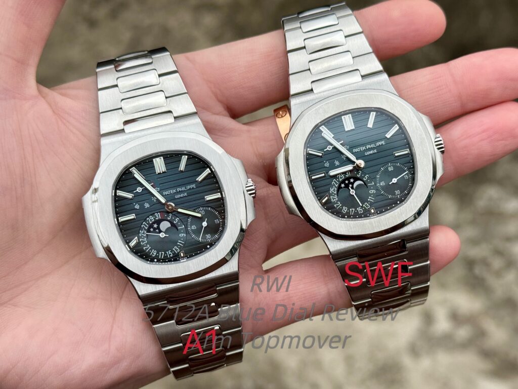
At the moment, SWF remains the safest and best overall custom blue dial option for the 5712A.
That does not mean SWF is perfect. In fact, under my own standards, neither SWF nor PPF really reaches the level of what I would call a truly strong custom dial.
But with the limited options currently available, SWF still gives the best overall balance. Its advantage does not come from just one single point. It comes from cleaner printing, better execution, stronger overall refinement, and a more convincing presentation under different lighting conditions.
As for PPF, I personally do not recommend it very much. The main reasons are still:
- Weaker lume
- Less clean ink application
- A more cheap-looking appearance under strong light
Buff also used to offer a 5712A dial, but I gave up on it quite early because the small details were not good enough, and the color performance was also too close to PPF for my taste.
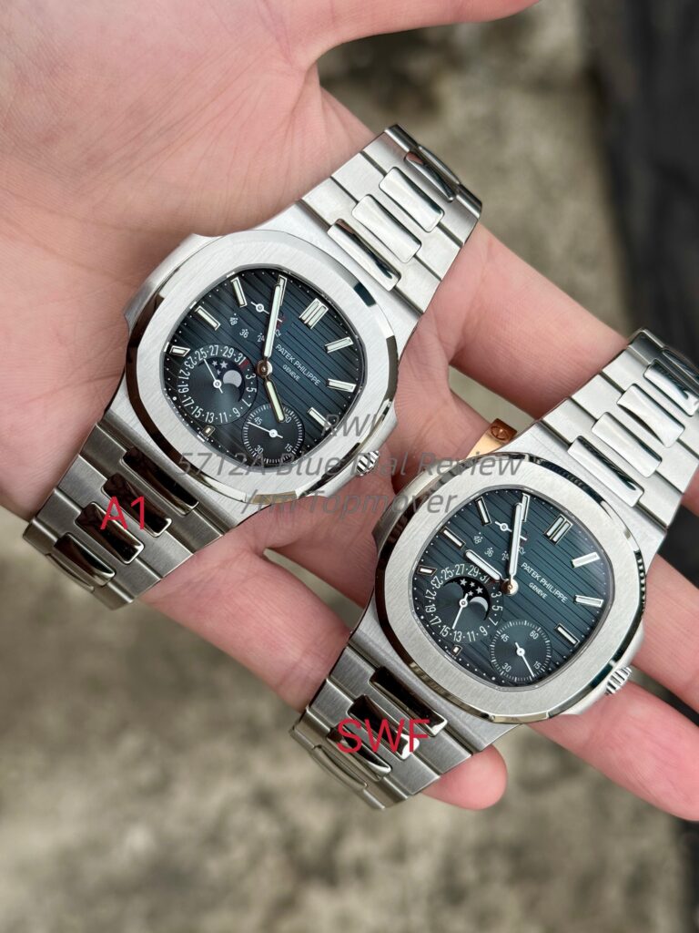
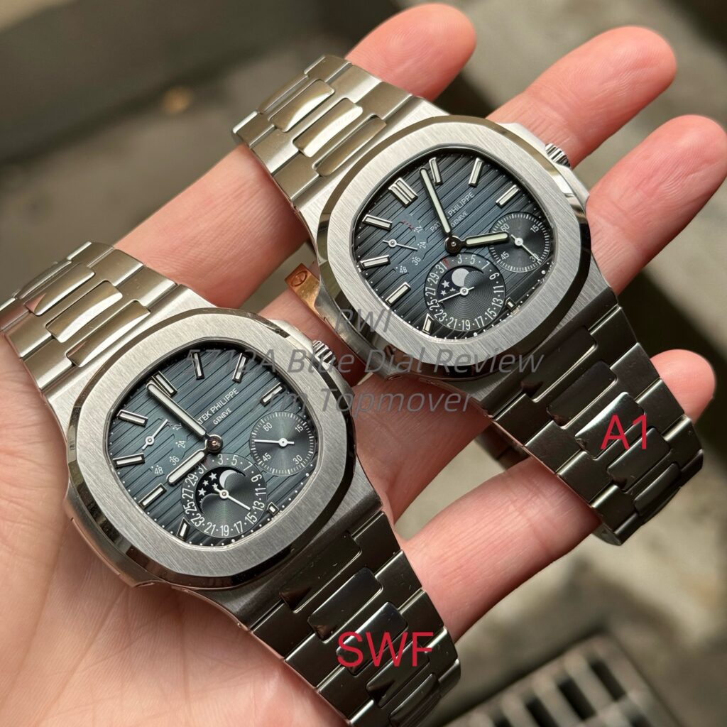
7. Additional Note on an Unnamed Custom Dial (“A1”)
Finally, I want to briefly mention one more dial.
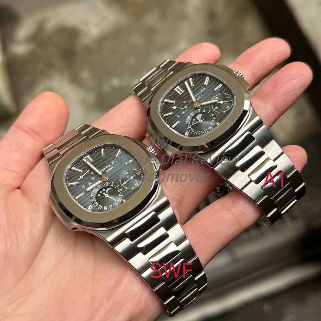
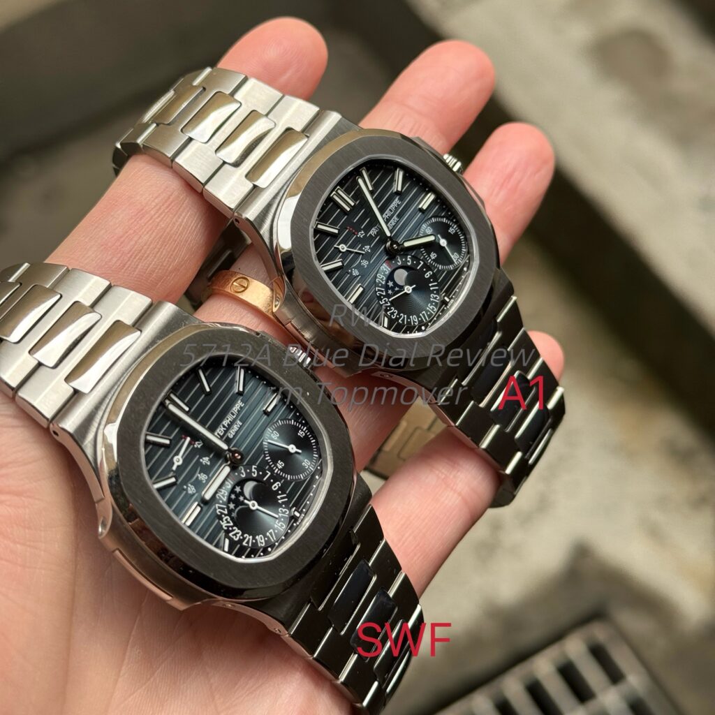
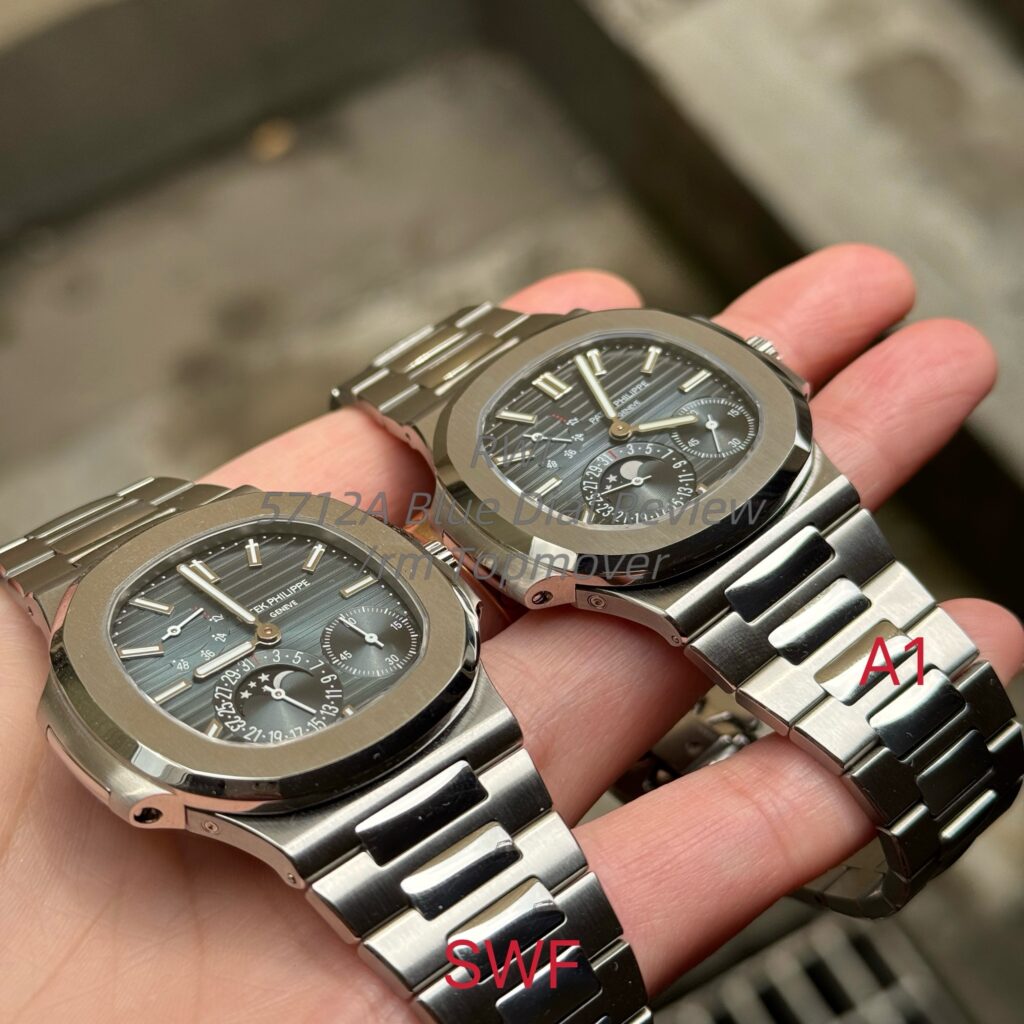
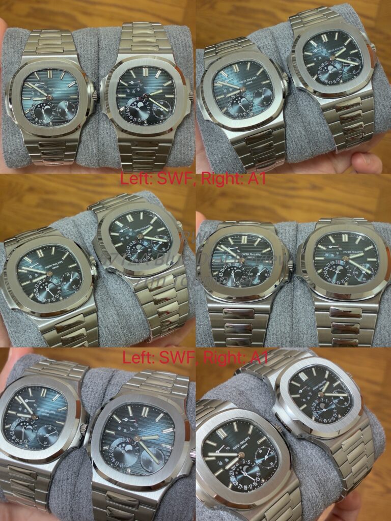
I got this dial around half a month ago. Since it does not seem to have a proper name, I will simply call it “A1” for now. At first, I thought it was an SWF dial, but after seeing it in hand and comparing it more carefully, I realized it was not.
Based on the sample I currently have, I personally think this dial performs better than SWF under certain lighting conditions.
The main reason is this: under some lighting, SWF’s blue-to-black outer transition is not strong enough. The darker outer area can look too light, and the base tone can sometimes lean slightly green. To my eyes, that green tint is not really the right kind of green for a 5712A.
In comparison, “A1” does not seem to have that issue as strongly. Under certain lighting conditions, it gives a more natural and more convincing color presentation than SWF.
However, I still want to stay as objective as possible here.
Because I no longer have my newer GEN 5712 dial, I cannot do a direct side-by-side comparison between this “A1” dial and the newer GEN.
For now, all I can say is that it looks very promising, and under some lighting conditions I personally do prefer it over SWF.
If I ever get another newer GEN dial again, I will do a more detailed and more objective comparison.
8. Final Thoughts
By this point, I have probably repeated the idea of “overall refinement” many times. I am not sure whether everyone will immediately understand what I mean, but I have tried my best to make it more specific.
What I mean is not just some vague compliment. I am talking about the final overall impression a dial gives: whether the printing is cleaner, whether the details are crisper, whether the color has depth, whether the transitions look natural, and whether the dial looks more premium or more cheap in real-world wear and real-world lighting.
As for the color itself, I still prefer to leave some of that judgment to each person after looking at the photos and videos, because in the end everyone has a different sensitivity to color and a different preference.
But if you ask me which blue dial is currently the most worth choosing for a 5712A build, my answer is still SWF.
Even if it is not perfect, it remains the most stable and the most worthwhile option available right now.
If the weather gets better later, I will continue adding more photos of the A1 dial. It has been rainy recently, so the lighting conditions have been limited.
As for the hands, moonphase, case, and other related parts, I may write about them separately another time if I get the chance.
Thanks for reading. I hope this review can provide some useful reference for anyone considering a 5712A build or dial swap.